|
Gallery |
 |
|
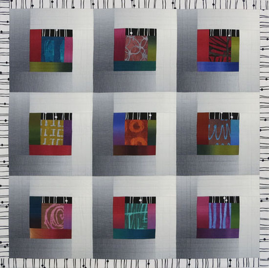
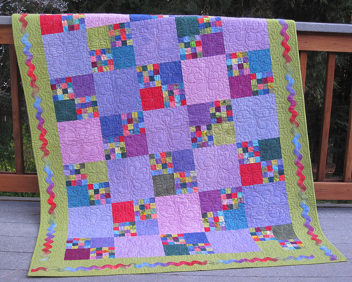
Best Friends
Kaffe Fassett Collective prints are the “mega-stars” in this happy little quilt, with a variety of gray-and-white fabrics playing a supporting role. The biggest challenge was gathering neutral fabrics that would visually separate from the colorful prints, and each other. My “Best Friends” pattern includes my paper-piecing sheets for the half-rectangle triangles (I call them “skinny triangles”) and cutting guides to minimize fabric waste and keep the outer edges of the triangle units on the straight of grain. I named my quilt “Best Friends” because although the blocks are made up of different colors and patterns, they all get along—like friends! 36” x 36”
Urban Poppies
Do you ever make a quilt based on the one you just finished? That’s what happened with this version in my “Urban Quilt” series. Three different colorways of Anna Maria Horner’s “Raindrops Poppies” fabric inspired the three different blocks. I repeated each block three times, making this a super-fast project. (This is a photo of the unfinished quilt top.) My “Urban Sunsets” pattern includes everything you need to make this quilt. 41" x 41"

Urban Poppies Table Runner
No time to make a quilt? How about a three-block runner? You’ll find the yardage requirements and step-by-step instructions in my “Urban Sunsets” pattern. 14" x 41"
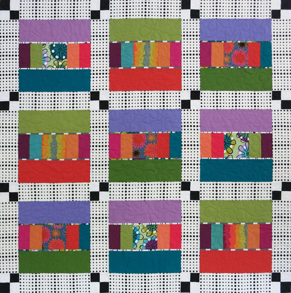
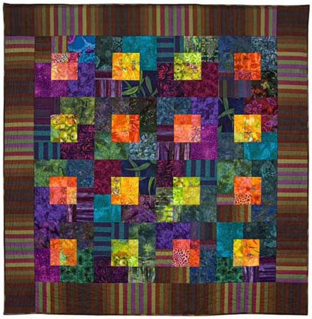
Spumoni
Spumoni is a "molded Italian ice cream made with layers of different colors and flavors, usually containing candied fruits and nuts." It seemed an apt title for a busy, cheerful quilt made of mostly Kaffe Fassett patterned and striped fabrics. The original plan was to make individual "color-story" blocks and separate them with neutral sashing. But when I looked at the blocks casually stuck on my design wall, I knew they were meant to be together. I had to let go of my idea of Kaffe-only fabrics; a few Michael James and Moda stripes were just the ticket. See Store for the pattern. This quilt is now a Zoom workshop. 38" x 38"
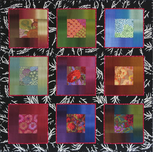 |
Lustrous Squares II Here are Lustrous blocks made using Gradations ombrés and Kaffe Fassett prints. I wanted to space out the blocks with sashing, and although I have many black-and-white prints, I went with this dramatic design. To keep the blocks from blending with the sashing, I added narrow red flanges. The skinny strips of intense color make the blocks appear to advance, as if they’re floating above a black-and-white background. Machine quilted by Cathy Stone. 48” x 48” |
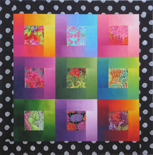
Lustrous Squares
This super-simple quilt takes advantage of the color and value gradations of ombré fabrics. By orienting the strips around the center square so that the light ends are in the upper right of each block and the dark ends in the lower left, you can suggest a sweep of light from a side source. A large-scale black-and-white border sets off the bocks but doesn’t compete. 50" x 50"

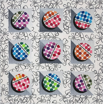
Pop Beads
Parent/child transparency, the illusion of two see-through colors overlapping to create a third color, is a challenge, but the reward is in the result. In this small quilt (featured in the Summer 2016 issue of Modern Patchwork) I used mostly Grunge fabrics and a few solids. Each block is made up of three values—a light "parent," a dark "parent," and a medium "child." It requires precision, so tackle it when you're feeling confident and careful. 36" x 36"
Urban Ombrés
I love what happens when you combine prints, stripes, and variegated fabrics. In this quilt, rich ombrés are paired with one gray ombré to create the illusion of light sweeping across the surface. Marcia Derse's organic prints in the block centers give the design visual weight. Add black-and-white stripes to complete this "urban environment." Machine quilted in a random plaid pattern by Cathy Stone. This quilt is now a Zoom workshop. 42" x 42"
Brushed Metal
When I first saw the "Serenity" ombrés, their subtle gradations reminded me of satiny metallic surfaces. Orienting the ombré strips so the light flows in both directions gives the quilt a sense of movement. Aligning the motifs in the sashing creates a smooth visual transition. Machine quilted by Sandra Bruce. 46" x 46"
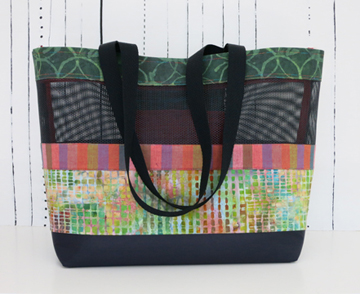
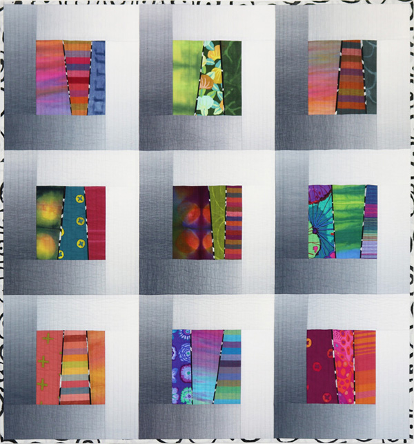
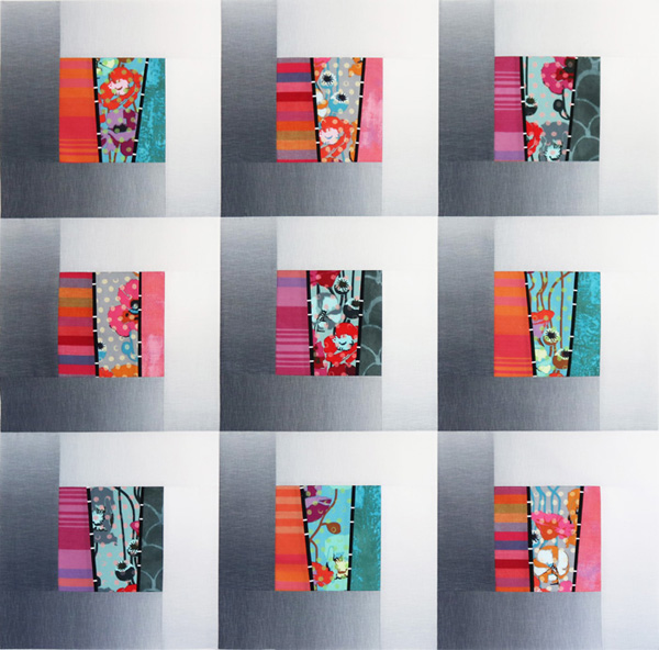
Market Bag
Combining fabrics has to be my favorite step in making a quilt, or in this case, a bag. I chose a green Marcia Derse print, a Kaffe Fassett stripe, and a multicolored batik. The fabrics are sewn onto a foundation of pet-screen material—not the easiest "fabric" to work with, but it makes for a very durable bag.
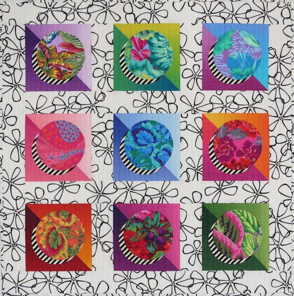
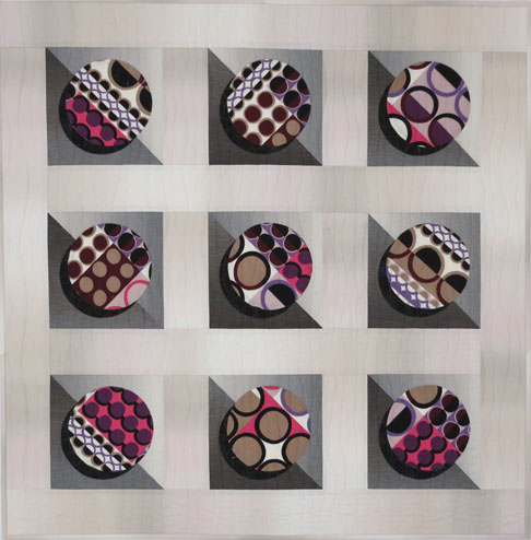
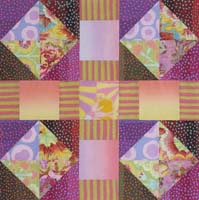
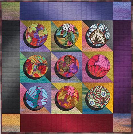
Sassy Circles II
I love circles quilts! This one has lots of pattern action: highly patterned florals for the circles, near-solid ombrés for the background triangles, geometric stripes for the "shadows," and a large-scale white-and-black print for the sashing. It's almost too much, but I had so much fun. See Store for pattern. 33" x 33"
Deco Circles
If the fabrics are right, you don't need many. One Alexander Henry art-deco fabric had enough pattern variation to create different yet related circles.The background triangles are cut from different areas of one gray ombré; the sashing is also an ombré, in a color I call “mushroom.” I love the light and movement of the ombrés—they bring a quilt to life. Made using my Elegant Circles pattern, also available in the Store. 33" x 33"
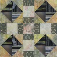
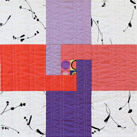
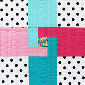
Aerial
This modern quilt features four blocks, with sashing and setting stones in between. There’s a hint of transparency in each block, where the small, dark batik squares appear to be layered on top of larger gray pieces. The key to this transparency is to choose four batik (or other) fabrics that are noticeably darker than the gray fabric. The gray-and-cream polka dots space out the blocks and make room for wide sashing. I quilted my quilt in wavy vertical lines. It’s a pattern; see Store. 38” x 38”
![]()
Transparent Circles
Overlay transparency, the illusion that a lighter or darker shape of see-through color floats over a layer of color below, creates an ethereal effect in this simple quilt. I used two kinds of fabrics: Kaffe Fassett shot cottons in light and medium-dark values, with 11 different Marcia Derse patterned and mottled-color fabrics for variety. 44" x 44"
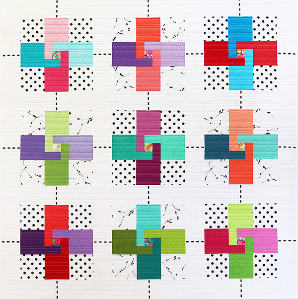
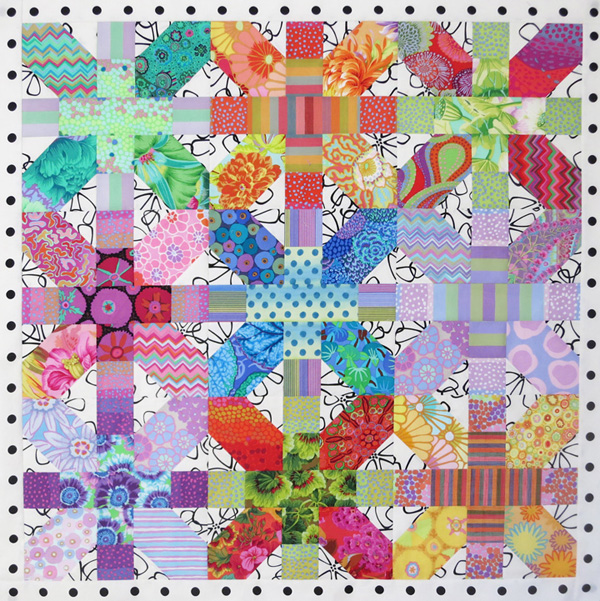
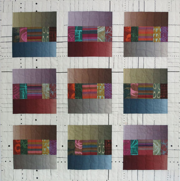
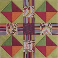
Black Opals & Ribbon Candy
Think “opalescence,” and most of us visualize the soft, milky colors of white opals. But when I discovered Australian black opals, with their flashes of brilliant color among much darker colors, I wanted to capture their natural beauty with fabric. This design is based on the Churn Dash block. By shifting the units in the nine-patch construction over and up by one unit, the secondary pattern (where four traditional Churn Dash blocks would meet) becomes primary, and the primary pattern takes on a supporting role. Machine quilted by Cathy Stone. See Store. 53 ¾" x 53 ¾"
 |
 |
 |
 |
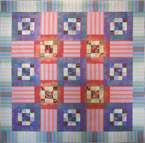
And as you can see here, fabrics in different colors and values create very different designs. Can you find the Churn Dash block in these images? (The center square of one Churn Dash block is at the center of each image.)
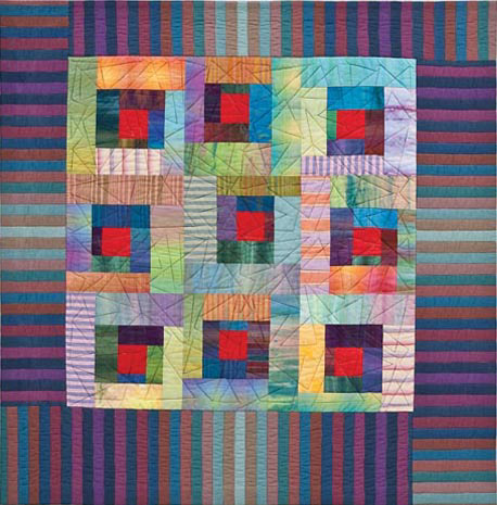
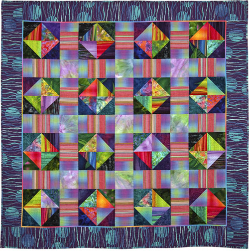
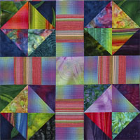
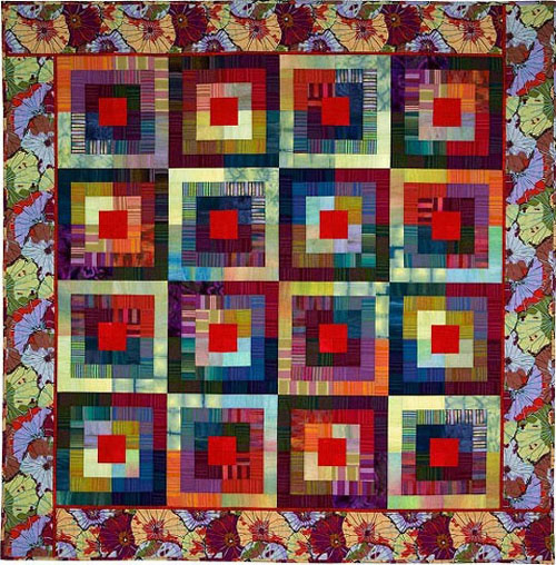
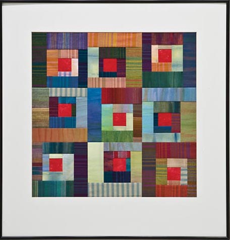
Squares and Stripes
In designing this modular quilt, I gave equal consideration to the concepts of value, temperature, and intensity. Wider logs of lighter-value color surround narrower, darker ones. Warm and cool colors mingle, as well as bright and dull ones. Intense center squares, a staple of traditional Log Cabin quilts, add a dash of red-hot color. Using a striped fabric for the border and centering the stripes suggests that the design flows vertically and horizontally, beneath the blocks. Machine quilted by Sharon Cook. 38" x 38"
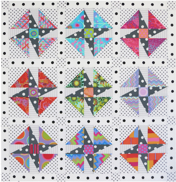
Elegant Circles
Three very different fabrics make magic in this little shadowed circle quilt, inspired by the work of Reynola Pakusich and begun in a Judy Mathieson workshop. Light appears to bounce off the borders; triangles of the same fabrics, in other colors, glow behind the intense patterned circles. Elin Noble fabrics in the remaining triangles and the quilt corners imply horizontal movement. Machine quilted by Carol Walsh. See Store. 32" x 32"
Sassy Circles
Light-value sashing makes a shadowed-circle quilt look airy and modern. The large-scale sashing fabric, which would logically take over visually, still recedes because it is mostly white. As a result, the brightly colored circles come forward and seem to float above a backdrop of funky flowers. 33" x 33". Machine quilted by Barbara Ceresa.
Luminaria
When it comes to the special effect of luminosity, color choices are everything: warm, intense colors surrounded by cooler, darker, duller colors just seem to glow. Fabrics with dappled light and color help to create a luminous look. In this modular quilt you’ll find lots of batiks, but I also used a few prints and stripes for variety and an element of surprise. See Store for pattern. Machine quilted by Carol Walsh. 61½" x 61½"

Galaxy
Transparency is easy to achieve using a Nine Patch pattern; the pieces just naturally read as “parents” and “child.” In this asymmetrical take on the traditional block, color, value, and pattern create not only the illusion of transparency, but also a visual flow within each block. Fabric is everything when working with transparency, and you must make mock-blocks to achieve the most convincing illusions. Machine quilted by Cathy Stone. 37" x 37"

Parfait Dreams
In this redesign of the traditional Connecticut block, the nine main blocks advance because the large triangles are dark and intense, while the alternate blocks and setting pieces recede, thanks to their mostly lighter and less-intense fabrics. The lighter-value striped border recedes even more, putting the focus on the center portion of the quilt. Machine quilted by Carol Walsh. 42" x 42"
 |
 |
 |
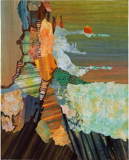
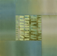
Earthscape
Value, temperature, and intensity are all at work in this small collage quilt. Light-value background fabrics by Elin Noble (www.elinnoble.com) suggest a sulfurous sky; dark-value foreground fabrics depict the volcanic landscape of Kilauea. Where the lava meets the ocean, light-value fabrics imply rising steam. The raw-edge pieces are adhered to the foundation with Misty Fuse. Machine quilted by Carol Walsh. 28" x 36"
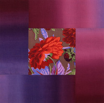
Lotus Leaves Squared
It’s all about value (lightness and darkness) in this design. Half of the blocks began with a red center square surrounded by a light, medium, and dark strip. For the other blocks, I reversed the order—a red center square surrounded by a dark, medium, and light strip. I then “whacked” each block horizontally and vertically to make quarter-units, which I assembled into the final blocks. I didn’t plan to border this quilt, but the Kaffe Fassett lotus-leaf print, which had languished on my shelf for some time, changed my mind. Machine quilted by Carol Walsh. 59" x 59"
Puss in the Corner on the Courthouse Steps
Kaffe Fassett (www.gloriouscolor.com) and Michael James fabrics make up this design, which was inspired by Terry Atkinsonn’s “Tile Tango” pattern (www.atkinsondesigns.com/patterns/patternDetail.asp?productID=131). Ikat-wash fabrics in light green, peach, and lavender mix with darker prints and stripes in the Puss-in-the-Corner units; strips of darker, brighter ikat-wash fabrics “corral” the units and form the blocks. The striped border has an opalescent quality, a special effect that occurs when various colors in similar values are juxtaposed. Machine quilted by Teresa Leavitt. 68" x 68"
Tile Dance
This quilt is a replica of the glass tile backsplash I designed for my kitchen, down to the colors and dimensions of the pieces. Value plays a major role: medium-light 8’’ plain squares serve as the backdrop for darker 4” plain squares and multi-value 1” squares. Temperature is an important element, too: the mix of warm and cool colors “makes the quilt dance,” said a friend, hence the name. I used solids from Cherrywood and tossed in a few batiks and checks to give it sparkle. Machine quilted by Carol Walsh. 50 1/2'' x 66 1/2''
|
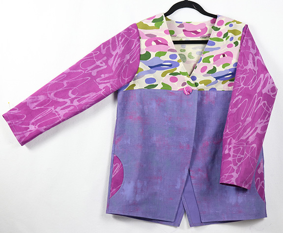
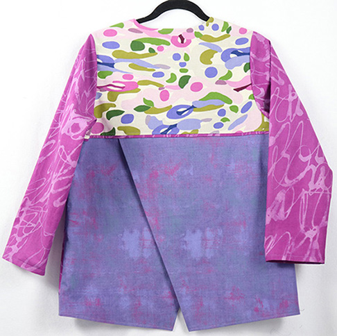
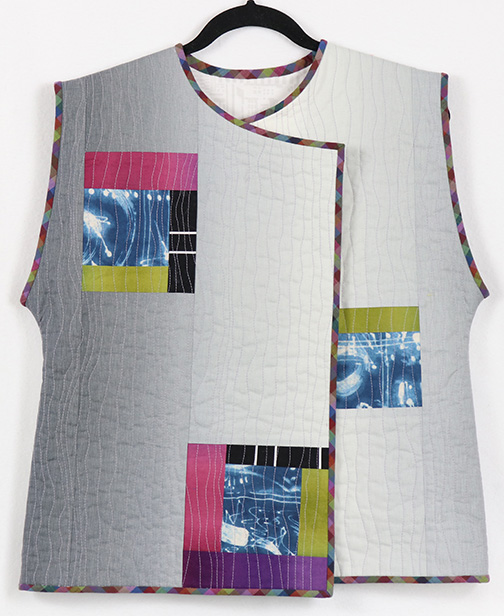
Garments |
 |
 |
|
|
|
 |
 |
 |
 |
|
 |
 |
|
|
|
 |
 |
 |
 |
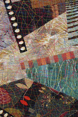 |
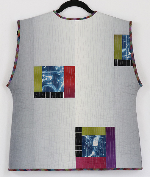
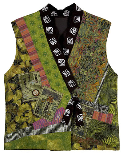
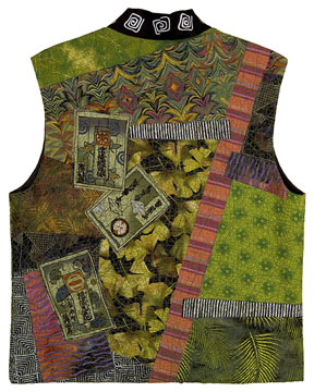
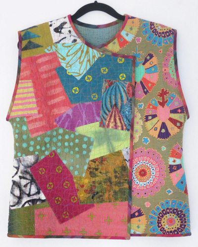
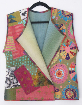
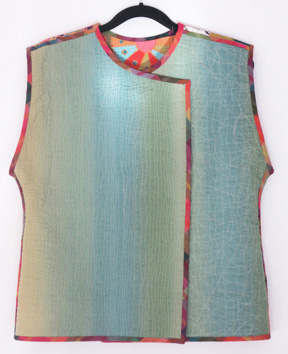
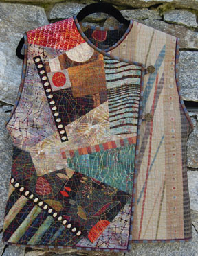
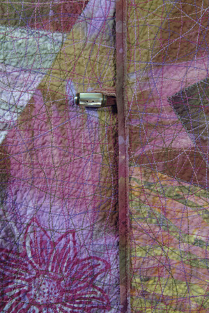
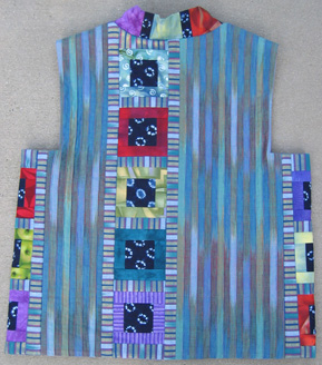
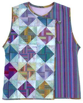
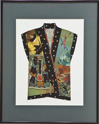
Crossover Collage Vest This is an asymmetrical vest with button-and-loop closure; you’ll see two other versions below. Using batiks, prints, and woven stripes, I collaged the right front over a layer of Osnaburg and foundation fabric, which becomes the lining, then randomly surface-stitched and washed the entire piece to create the crinkly texture. The left front and back are a Japanese fabric. The raw-edge binding is couched with a narrow chenille yarn. This vest is a pattern; See the Store. |
|
|
 |
 |
|
|
|
|
 |
 |
|
|
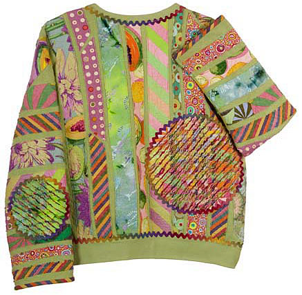 |
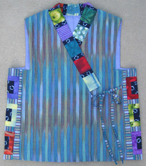
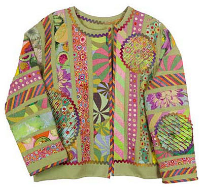
Happy Jacket The name I've given this colorful jacket is frivolous, but that's just how I felt when making it. And that's how I feel when I wear it—happy! Working on a sweatshirt is very forgiving; the raw-edge strips and surface stitching disguise any irregularities. (Translation: precision is not required.) Chenille circles and rick rack make it special. |
|
|
|
|
|
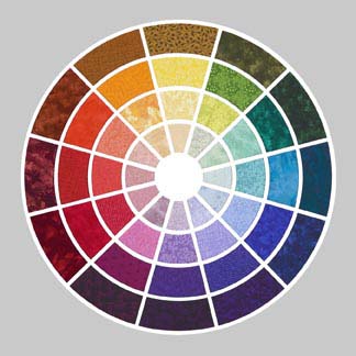
Color Wheel
Creating this fabric color wheel was like going on a scavenger hunt. I shopped and shopped to find the perfect fabrics: a blue-green that was equal parts blue and green, a just-right version of red-violet, a complement tint (the innermost circle) of green. It hangs, framed in black metal, in my studio and travels with me to workshops and lectures. “Christine’s Color Wheel,” with a four-page brochure of tips, strategies, and color combinations, is available in the Store. 23" x 23"